# Data Science Utils: Frequently Used Methods for Data Science
[](https://opensource.org/licenses/MIT)

[](https://github.com/idanmoradarthas/DataScienceUtils/issues)
[](https://datascienceutils.readthedocs.io/en/latest/?badge=latest)


[](https://badge.fury.io/py/data-science-utils)
[](https://anaconda.org/idanmorad/data-science-utils)
[](https://travis-ci.org/idanmoradarthas/DataScienceUtils)
[](https://coveralls.io/github/idanmoradarthas/DataScienceUtils?branch=master)
Data Science Utils extends the Scikit-Learn API and Matplotlib API to provide simple methods that simplify task and
visualization over data.
# Code Examples and Documentation
**Let's see some code examples and outputs.**
**You can read the full documentation with all the code examples from:
[https://datascienceutils.readthedocs.io/en/latest/](https://datascienceutils.readthedocs.io/en/latest/)**
In the documentation you can find more methods and more examples.
The API of the package is build to work with Scikit-Learn API and Matplotlib API. Here are some of capabilities of this
package:
## Metrics
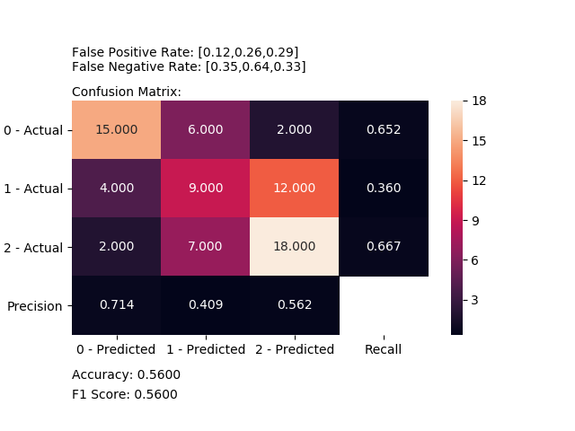
### Plot Confusion Matrix
Computes and plot confusion matrix, False Positive Rate, False Negative Rate, Accuracy and F1 score of a classification.
```python
from ds_utils.metrics import plot_confusion_matrix
plot_confusion_matrix(y_test, y_pred, [0, 1, 2])
```
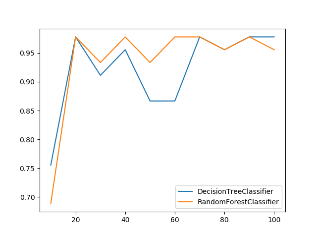
### Plot Metric Growth per Labeled Instances
Receives a train and test sets, and plots given metric change in increasing amount of trained instances.
```python
from ds_utils.metrics import plot_metric_growth_per_labeled_instances
plot_metric_growth_per_labeled_instances(x_train, y_train, x_test, y_test,
{"DecisionTreeClassifier":
DecisionTreeClassifier(random_state=0),
"RandomForestClassifier":
RandomForestClassifier(random_state=0, n_estimators=5)})
```
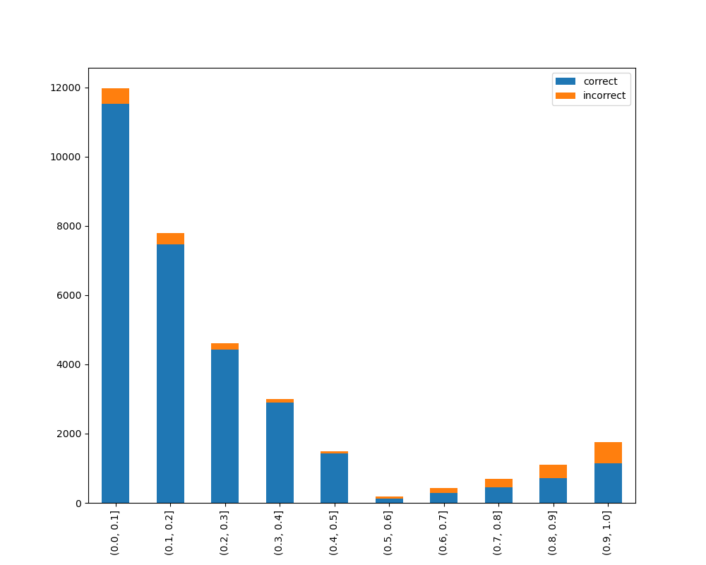
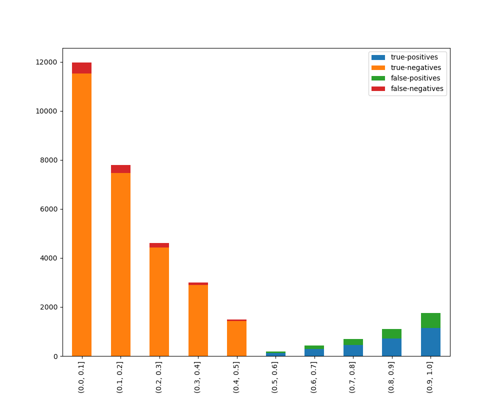
### Visualize Accuracy Grouped by Probability
Receives test true labels and classifier probabilities predictions, divide and classify the results and finally
plots a stacked bar chart with the results. [Original code](https://github.com/EthicalML/XAI)
```python
from ds_utils.metrics import visualize_accuracy_grouped_by_probability
visualize_accuracy_grouped_by_probability(test["target"], 1,
classifier.predict_proba(test[selected_features]),
display_breakdown=False)
```
Without breakdown:
With breakdown:
## Preprocess
### Visualize Feature
Receives a feature and visualize its values on a graph:
* If the feature is float then the method plots the distribution plot.
* If the feature is datetime then the method plots a line plot of progression of amount thought time.
* If the feature is object, categorical, boolean or integer then the method plots count plot (histogram).
```python
from ds_utils.preprocess import visualize_feature
visualize_feature(X_train["feature"])
```
|Feature Type |Plot|
|------------------|----|
|Float |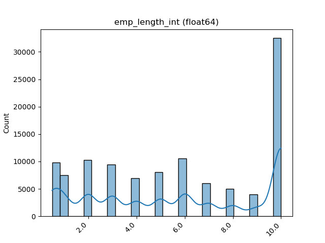|
|Integer ||
|Datetime |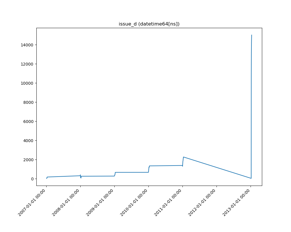|
|Category / Object |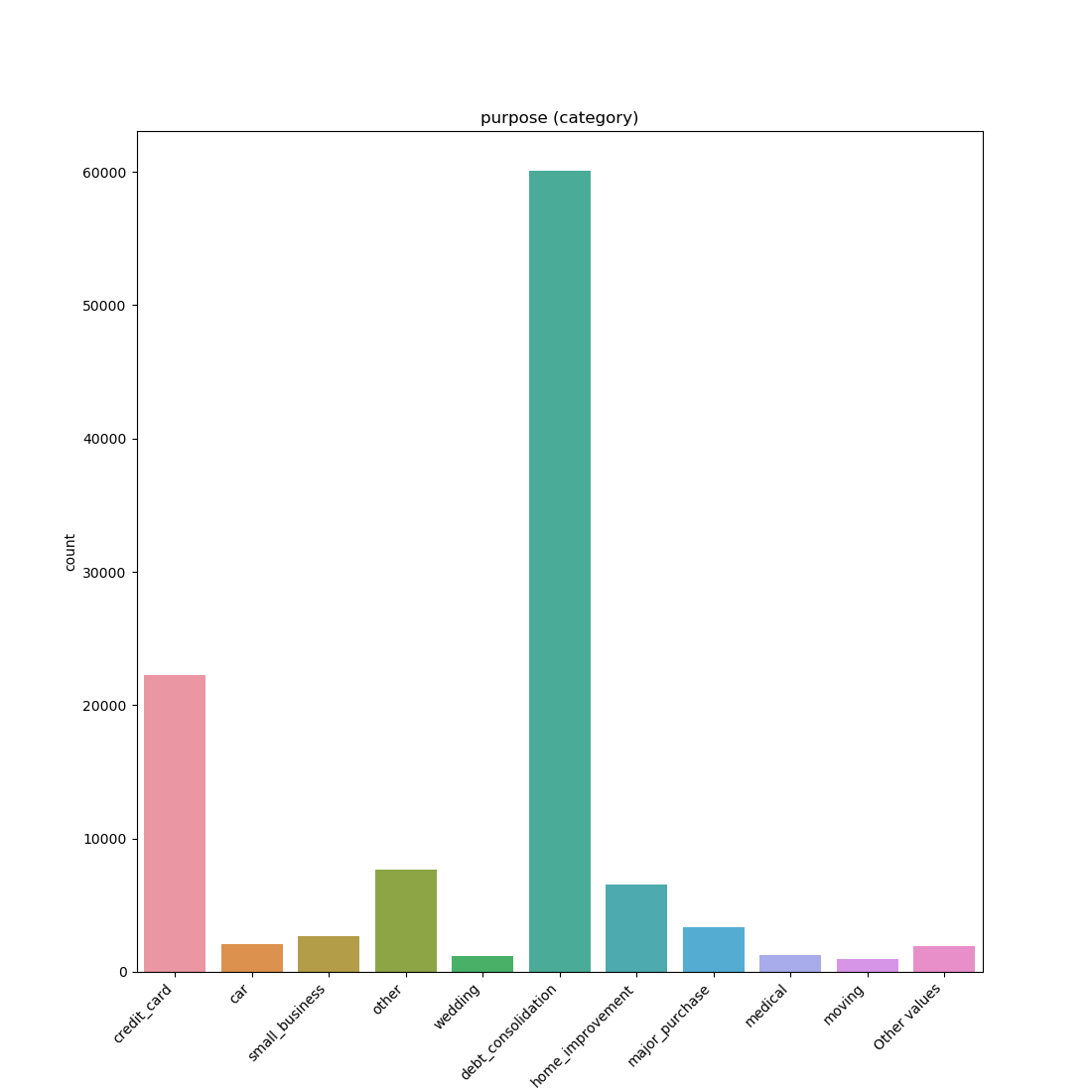|
|Boolean |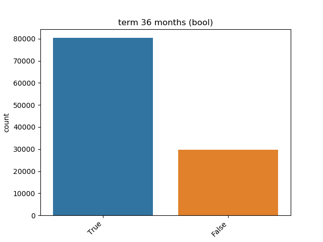|
### Get Correlated Features
Calculate which features correlated above a threshold and extract a data frame with the correlations and correlation to
the target feature.
```python
from ds_utils.preprocess import get_correlated_features
correlations = get_correlated_features(train, features, target)
```
|level_0 |level_1 |level_0_level_1_corr|level_0_target_corr|level_1_target_corr|
|----------------------|----------------------|--------------------|-------------------|-------------------|
|income_category_Low |income_category_Medium| 1.0 | 0.1182165609358650|0.11821656093586504|
|term\_ 36 months |term\_ 60 months | 1.0 | 0.1182165609358650|0.11821656093586504|
|interest_payments_High|interest_payments_Low | 1.0 | 0.1182165609358650|0.11821656093586504|
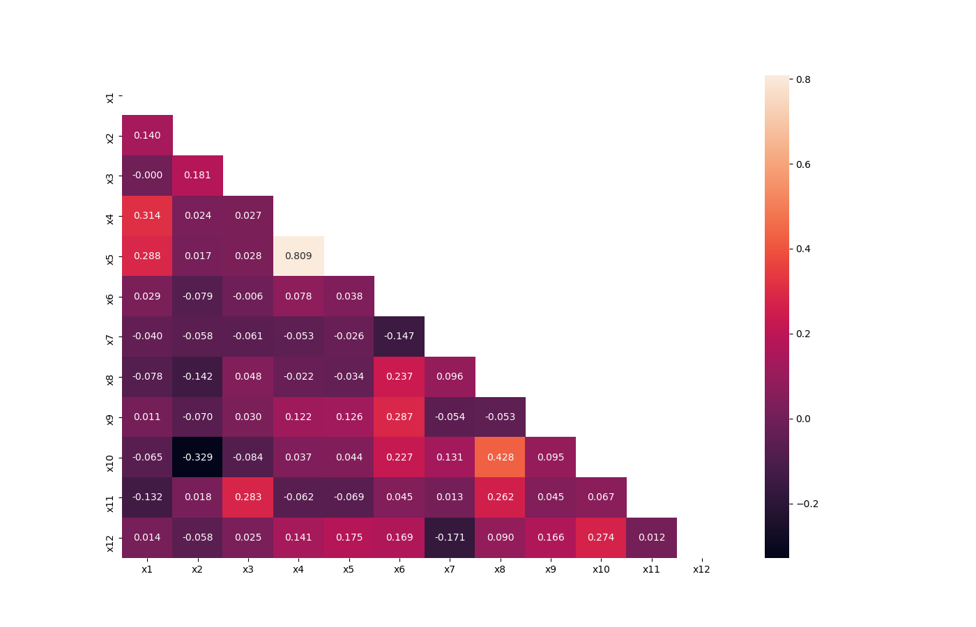
### Visualize Correlations
Compute pairwise correlation of columns, excluding NA/null values, and visualize it with heat map.
[Original code](https://seaborn.pydata.org/examples/many_pairwise_correlations.html)
```python
from ds_utils.preprocess import visualize_correlations
visualize_correlations(data)
```
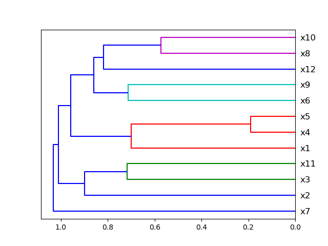
### Plot Correlation Dendrogram
Plot dendrogram of a correlation matrix. This consists of a chart that that shows hierarchically the variables that are
most correlated by the connecting trees. The closer to the right that the connection is, the more correlated the
features are. [Original code](https://github.com/EthicalML/XAI)
```python
from ds_utils.preprocess import plot_correlation_dendrogram
plot_correlation_dendrogram(data)
```
### Plot Features' Interaction
Plots the joint distribution between two features:
* If both features are either categorical, boolean or object then the method plots the shared histogram.
* If one feature is either categorical, boolean or object and the other is numeric then the method plots a boxplot chart.
* If one feature is datetime and the other is numeric or datetime then the method plots a line plot graph.
* If one feature is datetime and the other is either categorical, boolean or object the method plots a violin plot (combination of boxplot and kernel density estimate).
* If both features are numeric then the method plots scatter graph.
```python
from ds_utils.preprocess import plot_features_interaction
plot_features_interaction("feature_1", "feature_2", data)
```
| | Numeric | Categorical | Boolean | Datetime
|---------------|---------|-------------|---------|---------|
|**Numeric** |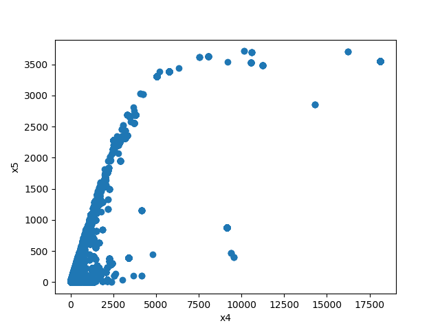| | | |
|**Categorical**|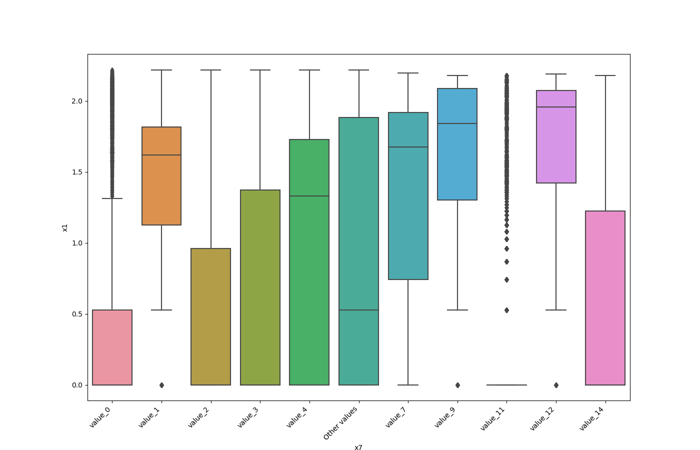|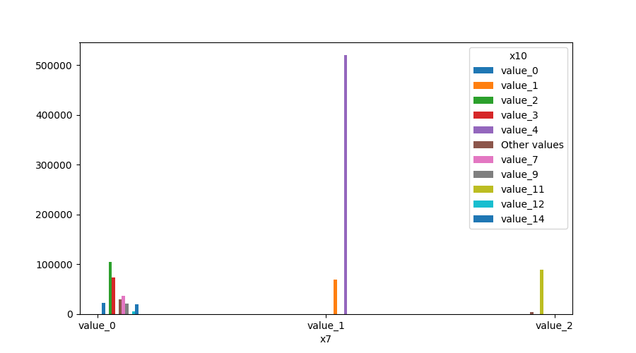| | |
|**Boolean** |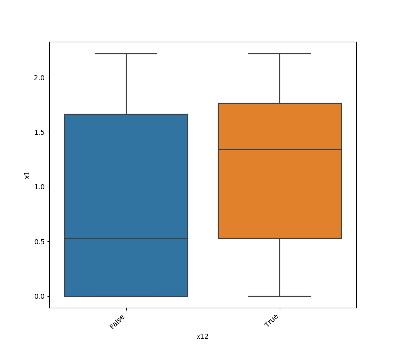|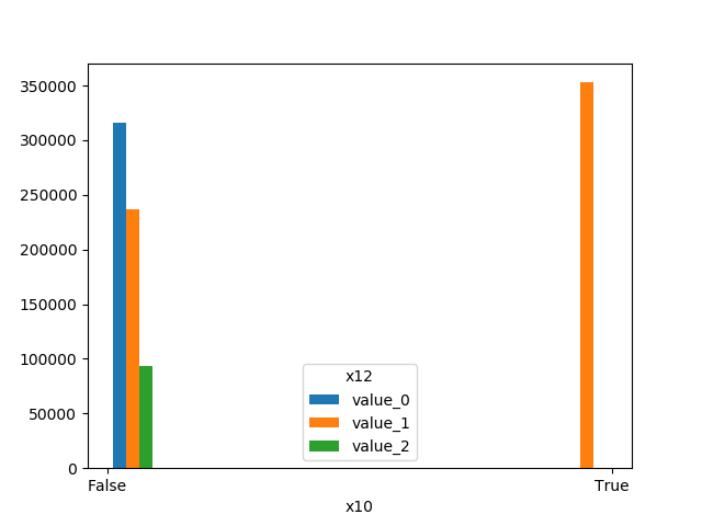|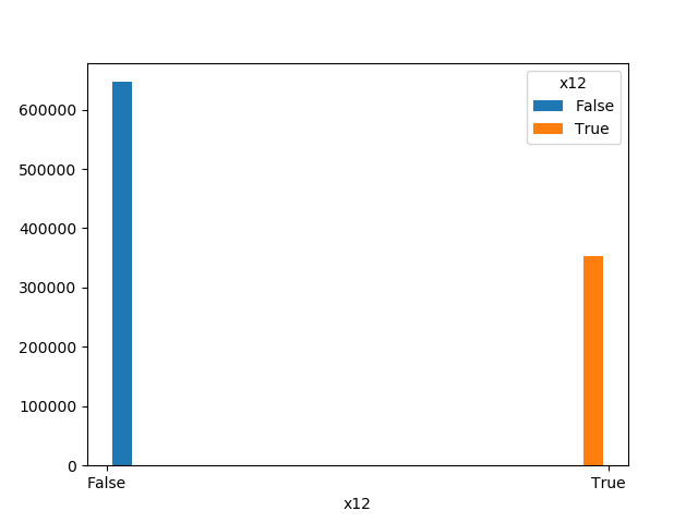| |
|**Datetime** |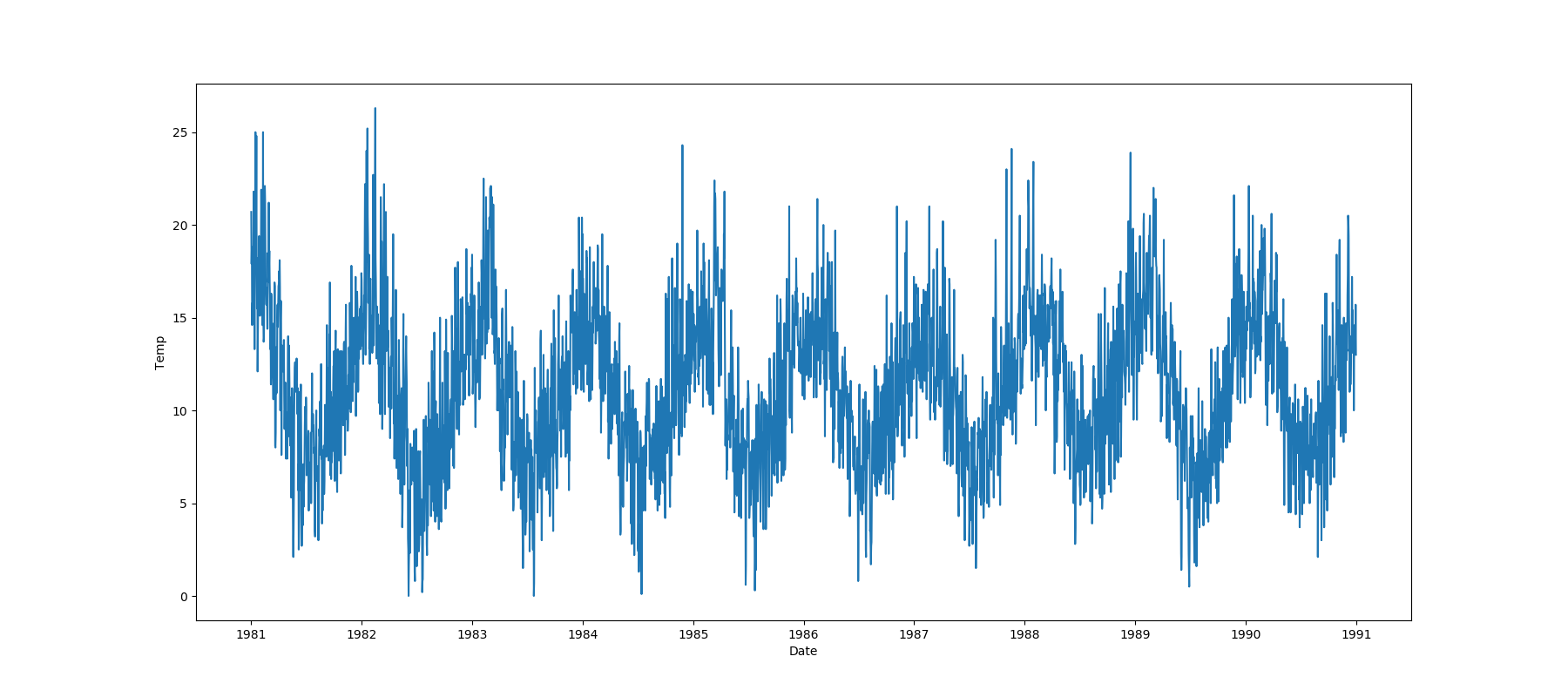|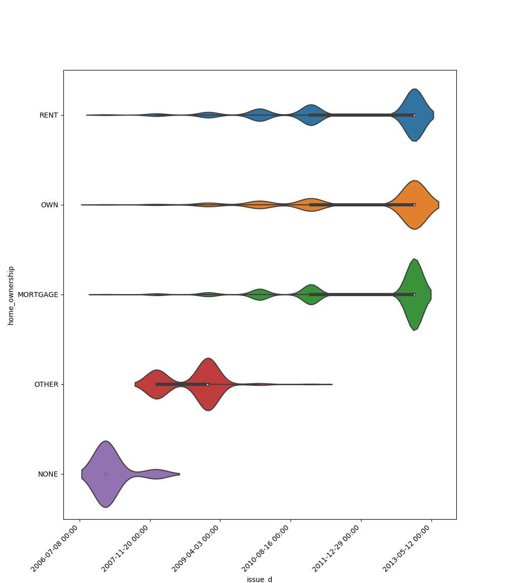|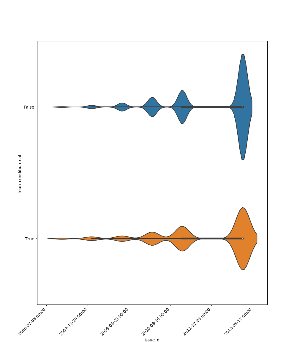|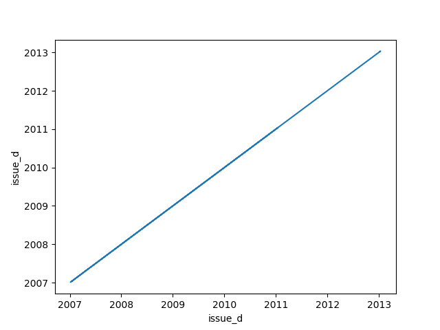|
## Strings
### Append Tags to Frame
Extracts tags from a given field and append them as dataframe.
A dataset that looks like this:
``x_train``:
|article_name|article_tags|
|------------|------------|
|1 |ds,ml,dl |
|2 |ds,ml |
``x_test``:
|article_name|article_tags|
|------------|------------|
|3 |ds,ml,py |
Using this code:
```python
import pandas
from ds_utils.strings import append_tags_to_frame
x_train = pandas.DataFrame([{"article_name": "1", "article_tags": "ds,ml,dl"},
{"article_name": "2", "article_tags": "ds,ml"}])
x_test = pandas.DataFrame([{"article_name": "3", "article_tags": "ds,ml,py"}])
x_train_with_tags, x_test_with_tags = append_tags_to_frame(x_train, x_test, "article_tags", "tag_")
```
will be parsed into this:
``x_train_with_tags``:
|article_name|tag_ds|tag_ml|tag_dl|
|------------|------|------|------|
|1 |1 |1 |1 |
|2 |1 |1 |0 |
``x_test_with_tags``:
|article_name|tag_ds|tag_ml|tag_dl|
|------------|------|------|------|
|3 |1 |1 |0 |
### Extract Significant Terms from Subset
Returns interesting or unusual occurrences of terms in a subset. Based on the [elasticsearch significant_text aggregation](https://www.elastic.co/guide/en/elasticsearch/reference/current/search-aggregations-bucket-significantterms-aggregation.html#_scripted).
```python
import pandas
from ds_utils.strings import extract_significant_terms_from_subset
corpus = ['This is the first document.', 'This document is the second document.',
'And this is the third one.', 'Is this the first document?']
data_frame = pandas.DataFrame(corpus, columns=["content"])
# Let's differentiate between the last two documents from the full corpus
subset_data_frame = data_frame[data_frame.index > 1]
terms = extract_significant_terms_from_subset(data_frame, subset_data_frame,
"content")
```
And the following table will be the output for ``terms``:
|third|one|and|this|the |is |first|document|second|
|-----|---|---|----|----|----|-----|--------|------|
|1.0 |1.0|1.0|0.67|0.67|0.67|0.5 |0.25 |0.0 |
## Unsupervised
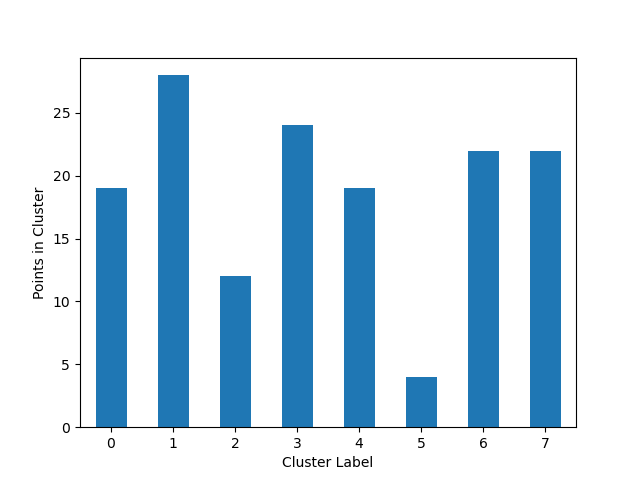
### Cluster Cardinality
Cluster cardinality is the number of examples per cluster. This method plots the number of points per cluster as a bar
chart.
```python
import pandas
from matplotlib import pyplot
from sklearn.cluster import KMeans
from ds_utils.unsupervised import plot_cluster_cardinality
data = pandas.read_csv(path/to/dataset)
estimator = KMeans(n_clusters=8, random_state=42)
estimator.fit(data)
plot_cluster_cardinality(estimator.labels_)
pyplot.show()
```
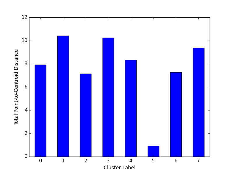
### Plot Cluster Magnitude
Cluster magnitude is the sum of distances from all examples to the centroid of the cluster. This method plots the
Total Point-to-Centroid Distance per cluster as a bar chart.
```python
import pandas
from matplotlib import pyplot
from sklearn.cluster import KMeans
from scipy.spatial.distance import euclidean
from ds_utils.unsupervised import plot_cluster_magnitude
data = pandas.read_csv(path/to/dataset)
estimator = KMeans(n_clusters=8, random_state=42)
estimator.fit(data)
plot_cluster_magnitude(data, estimator.labels_, estimator.cluster_centers_, euclidean)
pyplot.show()
```
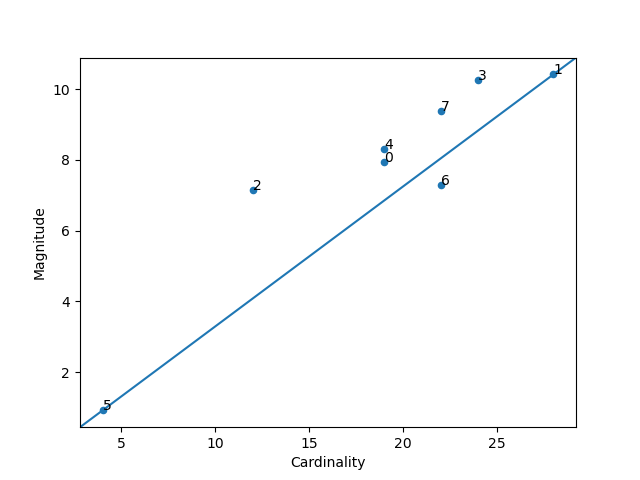
### Magnitude vs. Cardinality
Higher cluster cardinality tends to result in a higher cluster magnitude, which intuitively makes sense. Clusters
are anomalous when cardinality doesn't correlate with magnitude relative to the other clusters. Find anomalous
clusters by plotting magnitude against cardinality as a scatter plot.
```python
import pandas
from matplotlib import pyplot
from sklearn.cluster import KMeans
from scipy.spatial.distance import euclidean
from ds_utils.unsupervised import plot_magnitude_vs_cardinality
data = pandas.read_csv(path/to/dataset)
estimator = KMeans(n_clusters=8, random_state=42)
estimator.fit(data)
plot_magnitude_vs_cardinality(data, estimator.labels_, estimator.cluster_centers_, euclidean)
pyplot.show()
```
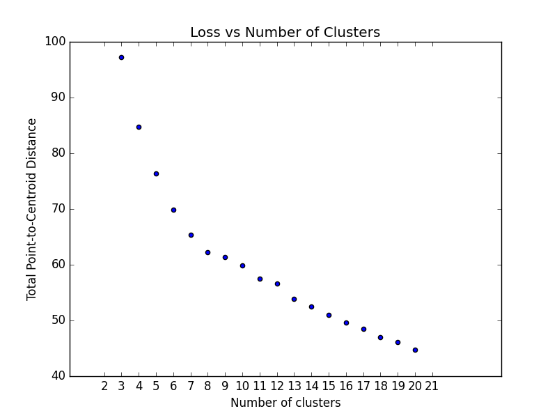
### Optimum Number of Clusters
k-means requires you to decide the number of clusters ``k`` beforehand. This method runs the KMean algorithm and
increases the cluster number at each try. The Total magnitude or sum of distance is used as loss.
Right now the method only works with ``sklearn.cluster.KMeans``.
```python
import pandas
from matplotlib import pyplot
from scipy.spatial.distance import euclidean
from ds_utils.unsupervised import plot_loss_vs_cluster_number
data = pandas.read_csv(path/to/dataset)
plot_loss_vs_cluster_number(data, 3, 20, euclidean)
pyplot.show()
```
## XAI
### Generate Decision Paths
Receives a decision tree and return the underlying decision-rules (or 'decision paths') as text (valid python syntax).
[Original code](https://stackoverflow.com/questions/20224526/how-to-extract-the-decision-rules-from-scikit-learn-decision-tree)
```python
from sklearn.tree import DecisionTreeClassifier
from ds_utils.xai import generate_decision_paths
# Create decision tree classifier object
clf = DecisionTreeClassifier(max_depth=3)
# Train model
clf.fit(x, y)
print(generate_decision_paths(clf, feature_names, target_names.tolist(),
"iris_tree"))
```
The following text will be printed:
```
def iris_tree(petal width (cm), petal length (cm)):
if petal width (cm) <= 0.8000:
# return class setosa with probability 0.9804
return ("setosa", 0.9804)
else: # if petal width (cm) > 0.8000
if petal width (cm) <= 1.7500:
if petal length (cm) <= 4.9500:
# return class versicolor with probability 0.9792
return ("versicolor", 0.9792)
else: # if petal length (cm) > 4.9500
# return class virginica with probability 0.6667
return ("virginica", 0.6667)
else: # if petal width (cm) > 1.7500
if petal length (cm) <= 4.8500:
# return class virginica with probability 0.6667
return ("virginica", 0.6667)
else: # if petal length (cm) > 4.8500
# return class virginica with probability 0.9773
return ("virginica", 0.9773)
```
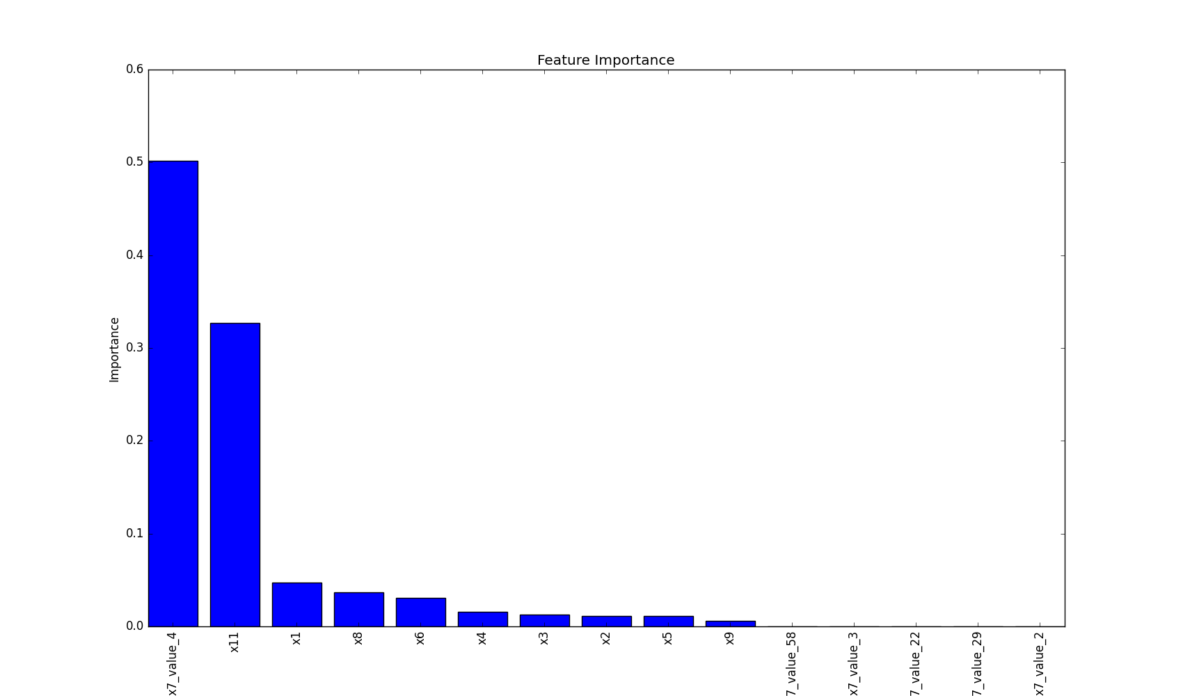
## Plot Features` Importance
plot feature importance as a bar chart.
```python
import pandas
from matplotlib import pyplot
from sklearn.tree import DecisionTreeClassifier
from ds_utils.xai import plot_features_importance
data = pandas.read_csv(path/to/dataset)
target = data["target"]
features = data.columns.to_list()
features.remove("target")
clf = DecisionTreeClassifier(random_state=42)
clf.fit(data[features], target)
plot_features_importance(features, clf.feature_importances_)
pyplot.show()
```
Excited?
Read about all the modules here and see more abilities:
* [Metrics](https://datascienceutils.readthedocs.io/en/latest/metrics.html) - The module of metrics contains methods that help to calculate and/or visualize evaluation performance of an algorithm.
* [Preprocess](https://datascienceutils.readthedocs.io/en/latest/preprocess.html) - The module of preprocess contains methods that are processes that could be made to data before training.
* [Strings](https://datascienceutils.readthedocs.io/en/latest/strings.html) - The module of strings contains methods that help manipulate and process strings in a dataframe.
* [Unsupervised](https://datascienceutils.readthedocs.io/en/latest/unsupervised.html) - The module od unsupervised contains methods that calculate and/or visualize evaluation performance of an unsupervised model.
* [XAI](https://datascienceutils.readthedocs.io/en/latest/xai.html) - The module of xai contains methods that help explain a model decisions.
## Contributing
Interested in contributing to Data Science Utils? Great! You're welcome, and we would love to have you. We follow
the [Python Software Foundation Code of Conduct](http://www.python.org/psf/codeofconduct/) and
[Matplotlib Usage Guide](https://matplotlib.org/tutorials/introductory/usage.html#coding-styles).
No matter your level of technical skill, you can be helpful. We appreciate bug reports, user testing, feature
requests, bug fixes, product enhancements, and documentation improvements.
Thank you for your contributions!
## Find a Bug?
Check if there's already an open [issue](https://github.com/idanmoradarthas/DataScienceUtils/issues) on the topic. If
needed, file an issue.
## Open Source
Data Science Utils license is [MIT License](https://opensource.org/licenses/MIT).
## Installing Data Science Utils
Data Science Utils is compatible with Python 3.6 or later. The simplest way to install Data Science Utils and its
dependencies is from PyPI with pip, Python's preferred package installer:
```bash
pip install data-science-utils
```
Note that this package is an active project and routinely publishes new releases with more methods. In order to
upgrade Data Science Utils to the latest version, use pip as follows:
```bash
pip install -U data-science-utils
```
Alternatively you can install from source by cloning the repo and running:
```bash
git clone https://github.com/idanmoradarthas/DataScienceUtils.git
cd DataScienceUtils
python setup.py install
```
Or install using pip from source:
```bash
pip install git+https://github.com/idanmoradarthas/DataScienceUtils.git
```
If you're using Anaconda, you can install using conda:
```bash
conda install -c idanmorad data-science-utils
```


